A Logo That Speaks Volumes
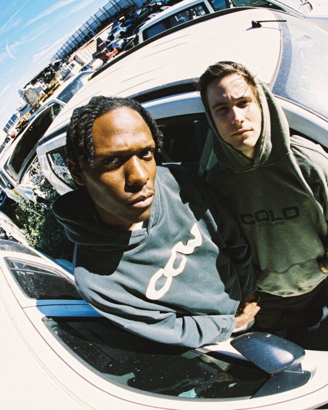
In today’s streetwear landscape, branding is everything—but few logos capture raw emotion and identity like the Cold Culture logo. This Canadian-born brand has built a cult following through its unique approach to design: minimal, melancholic, and intentional. The logo isn’t just a stamp of ownership—it’s an extension of the brand’s voice, carefully crafted to reflect its artistic roots and narrative-driven clothing.
The Cold Culture Philosophy
To understand the logo, you have to understand the Cold Culture mindset. The brand doesn’t rely on flashy graphics or bold statements. Instead, it embraces subtle storytelling through clean silhouettes, muted color palettes, and thoughtful design. Each hoodie, T-shirt, or crewneck feels like a canvas of emotion—expressing solitude, ambition, nostalgia, or clarity.
This emotion-led aesthetic directly influences how the logo is designed and placed. It’s not just branding—it’s visual poetry.
Design Aesthetic of the Logo
At a glance, the Cold Culture logo may appear simple. But every detail has meaning:
-
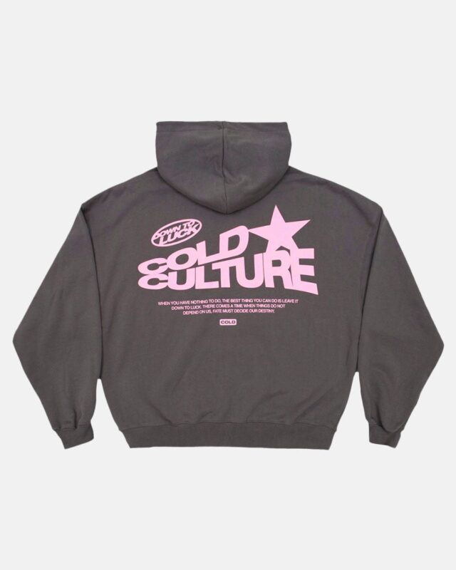
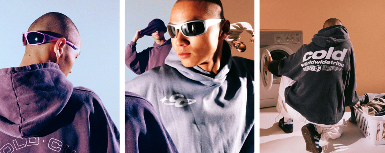
Cracked Fonts & Distressed Lettering: One of the most recognizable styles in Cold Culture’s logo variations is its cracked font—a visual representation of imperfection, growth, and rawness. It evokes a feeling of something broken yet beautiful.
-
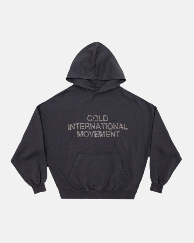
Handwritten Typography: Some collections feature a hand-drawn or scrawled version of the logo, almost like a personal note. This makes each piece feel intimate and real, connecting directly with the wearer.
-
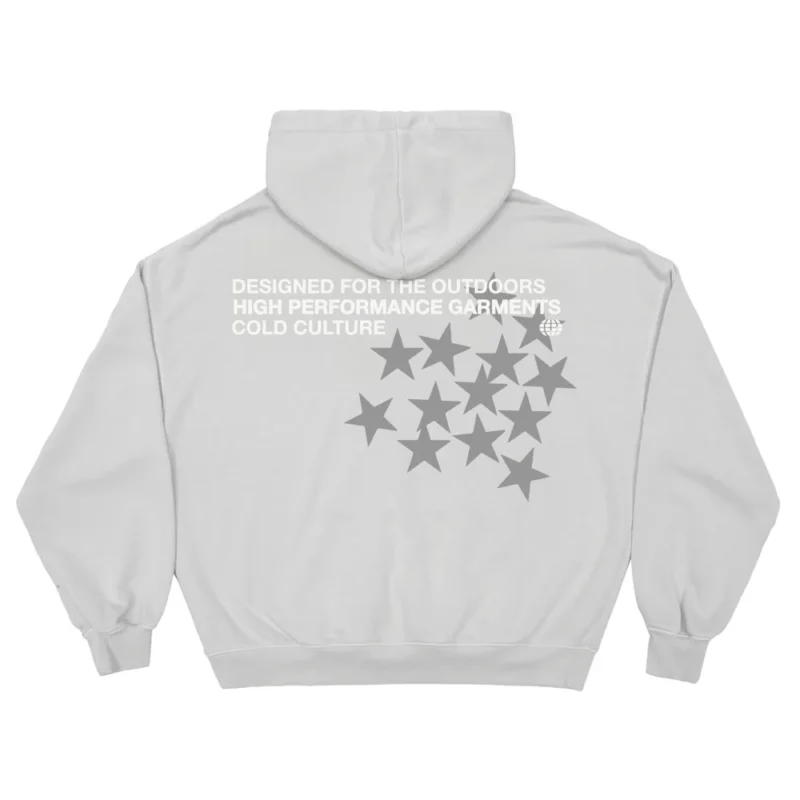
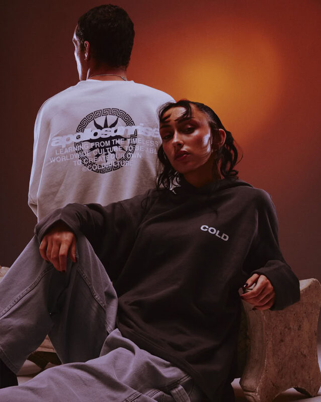
Minimalist Layouts: You’ll rarely see the logo oversized or in-your-face. It’s often placed subtly—on the lower back, sleeve, or hem. In many pieces, it’s integrated into poetic text or reflective slogans.
This approach gives the logo timeless appeal, aligning with fashion’s shift toward quiet luxury and emotional storytelling.
Placement: Where You’ll See the Logo
The placement of the Cold Culture logo is just as meaningful as its design. Instead of splashing the logo front and center like many streetwear brands, Cold Culture chooses more thoughtful placements:
-
Bottom hems
-
Sleeve cuffs
-
Back neck areas
-
Embedded in graphic artwork
-
Accompanied by quotes or poetry
These placements keep the focus on the message behind the garment, not just the branding.
Cold Culture Logo as a Symbol of Mood
The true genius of the Cold Culture logo lies in its ability to evoke mood and emotion. Whether it appears faded, cracked, or handwritten, the logo always feels intentional. It mirrors the atmosphere of the collection it’s part of—sometimes melancholic, other times dreamy, always rooted in realism.
Unlike brands that use logos to signal hype or flex status, Cold Culture uses its logo as a mirror—to reflect the inner world of the wearer.
Cultural Influence and Recognition
Though relatively new, Cold Culture has made a big impact in the North American fashion scene, particularly among Gen Z and millennial audiences looking for meaningful streetwear. The logo has become a recognizable marker of taste and emotion-driven fashion.
It resonates with fans of similar brands like Hidden NY, Aime Leon Dore, and Essentials by Fear of God, yet it maintains a distinct visual identity. The Cold Culture logo represents an emerging wave of streetwear that values mood over hype, poetry over performance.
The Future of the Logo
As Cold Culture evolves, its logo remains a consistent yet adaptable element of its identity. Each new collection gives the brand a chance to reinterpret the logo’s mood, placement, and aesthetic.
You might see:
-
Embossed or puff-printed logos
-
More minimal “cold” wordmarks
-
Merged typography with artistic sketches or celestial symbols
Whatever the form, the logo will continue to reflect the brand’s artistic soul.
FAQs About the Cold Culture Logo
Q1: What does the Cold Culture logo mean?
The Cold Culture logo symbolizes the brand’s core values—emotion, imperfection, and minimalism. It often appears cracked or handwritten to reflect rawness and authenticity.
Q2: Is the logo always the same on all products?
No. Cold Culture frequently experiments with different versions of the logo across collections, from clean serif fonts to artistic scribbles and distorted type.
Q3: Why is the logo placement so subtle?
Because the brand believes in storytelling through mood and message, not just branding. Subtle placement aligns with its minimalist and emotional aesthetic.
Q4: What makes the Cold Culture logo different from other streetwear brands?
While many brands use logos for hype or status, Cold Culture uses its logo to enhance mood, create intimacy, and support storytelling in each piece.
Q5: Where can I buy authentic Cold Culture apparel with the original logo?
The safest place to buy is through the official Cold Culture website or verified retailers. Be cautious of imitations, especially on reselling platforms.
Final Thoughts
The Cold Culture logo is more than a graphic—it’s a reflection of identity. In a world filled with overstated branding, Cold Culture offers a quiet voice with powerful intent. Its logo is subtle, poetic, and deeply meaningful—mirroring the emotions that run through each carefully crafted garment.
For fans of fashion that speaks softly but hits deeply, Cold Culture isn’t just a brand—it’s a movement, and its logo is its heart.